TECH CROWD INFOGRAPHIC
TYPE: Data Visualization
CLIENT: Student Project
DATE: February 2023
THE PROJECT: Using a provided set of data, create a full-page infographic to be featured in the fictitious tech magazine, Tech Crowd.
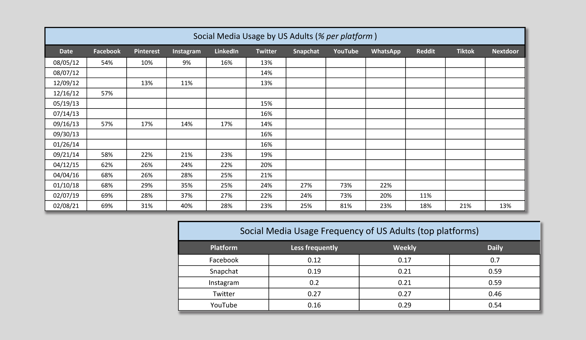
PROVIDED DATA SET

The above sample data was provided solely for the purpose of this project and does not represent actual results of a specific study.
THE DATA
- Results of a nine-year study tracking social media platform usage of adults in the United States
- This information was collected periodically throughout the study
- A secondary data set lists the frequency of use for several of the most popular platforms
THE CHARTS
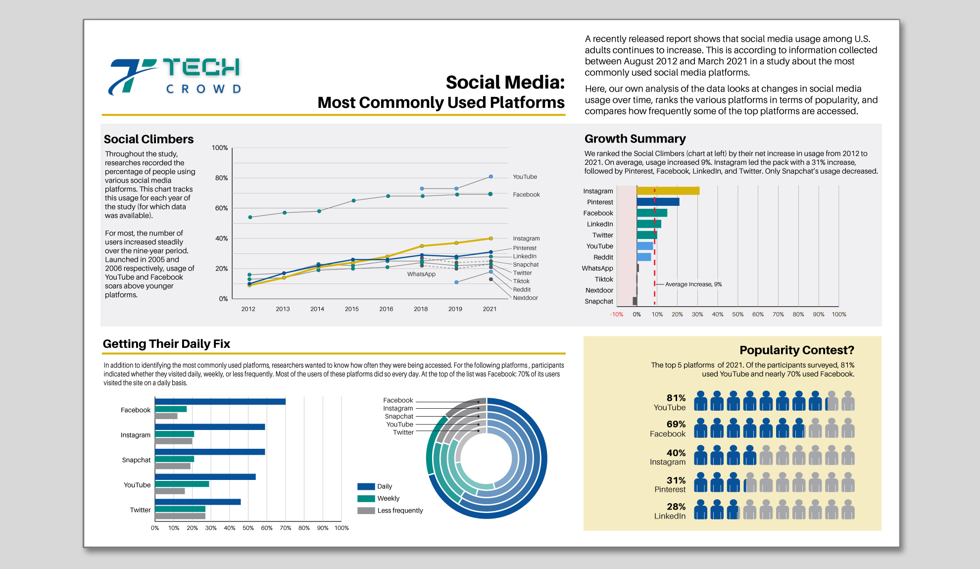
- Track changes in the percentage of users of each platform over time
- Rank the various platforms in terms of popularity
- Compare how often users engaged with social media
THE STORY
- Overall usage of social media increased steadily for the duration of the study
- YouTube and Facebook are by far the most popular in terms of percentage of users
- Instagram and Pinterest experienced the highest net increase in users
- Users of Facebook, Instagram, Snapchat, YouTube and Twitter tend to engage daily
Copyright 2024, Hugh Kirkland Alford
